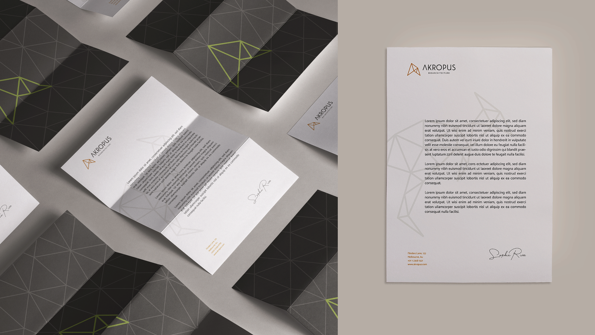
Akropus Bioarchitecture
Naming | Identidade Visual
[PT]
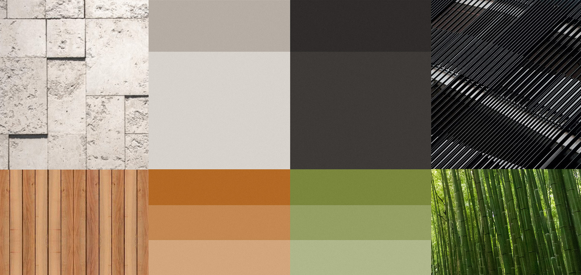
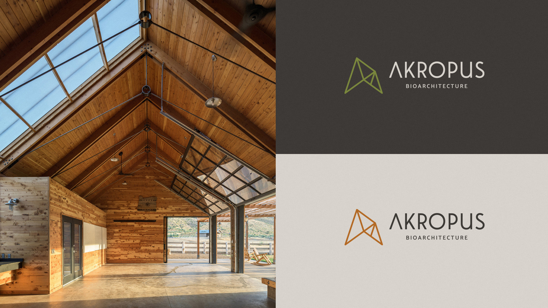
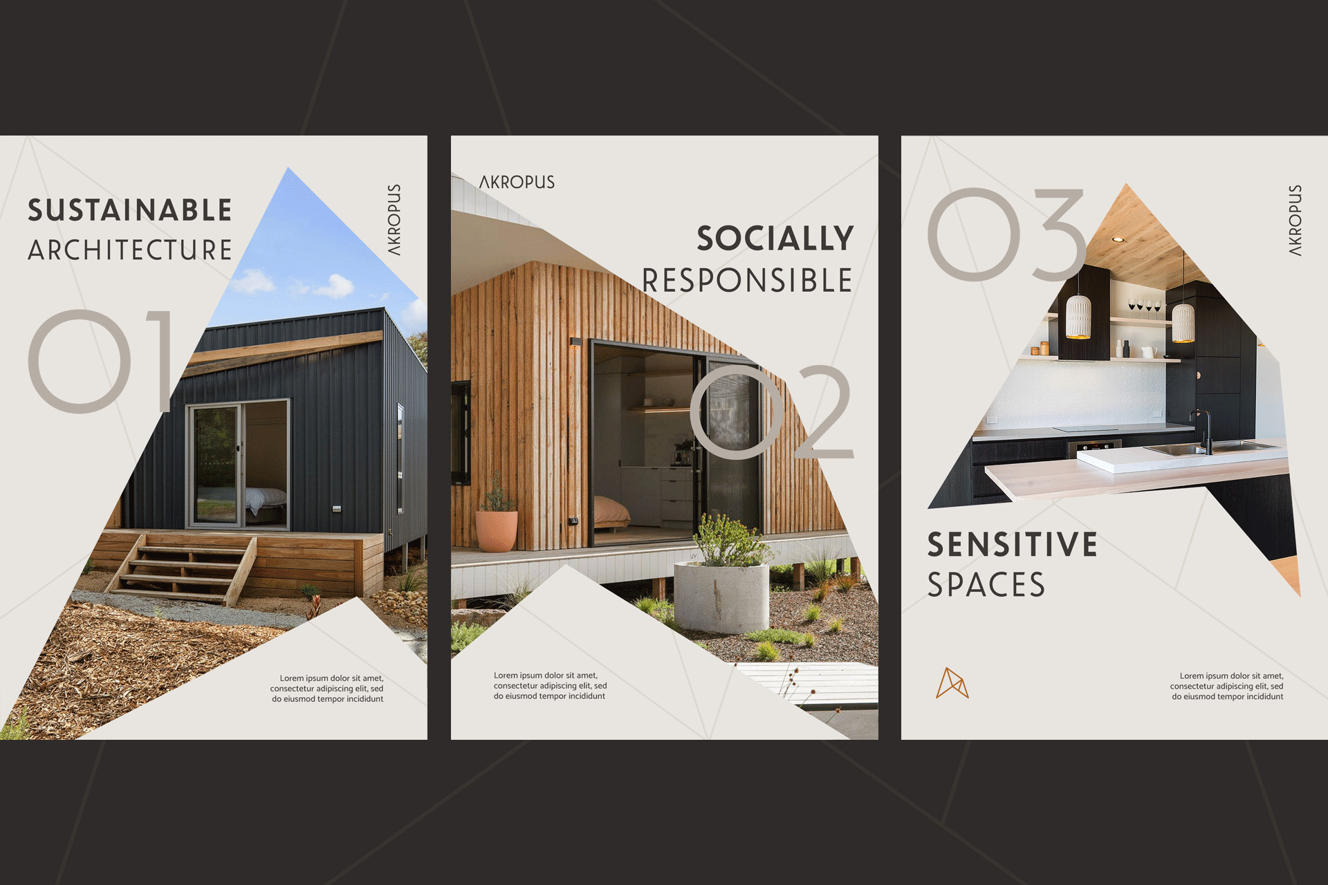
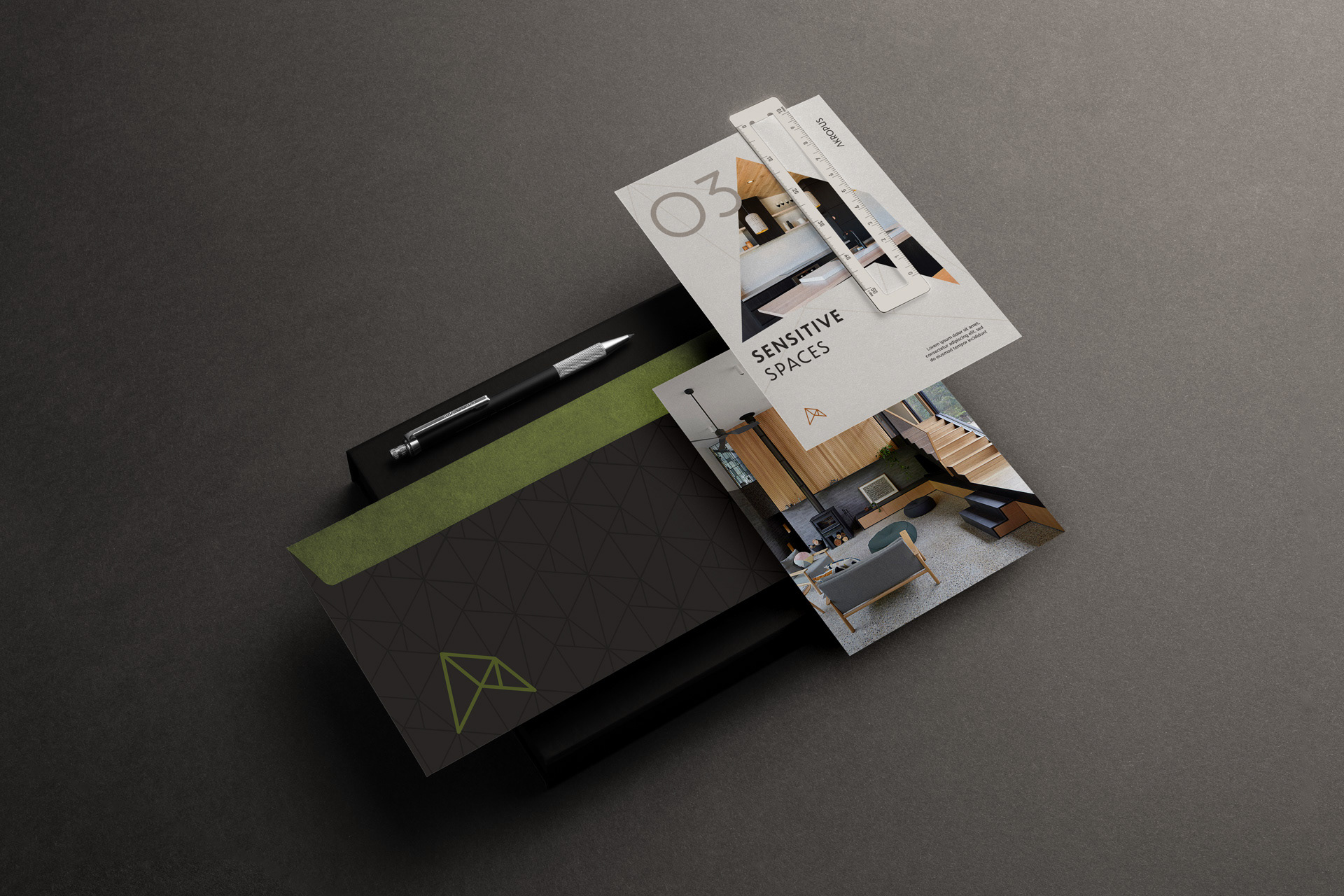
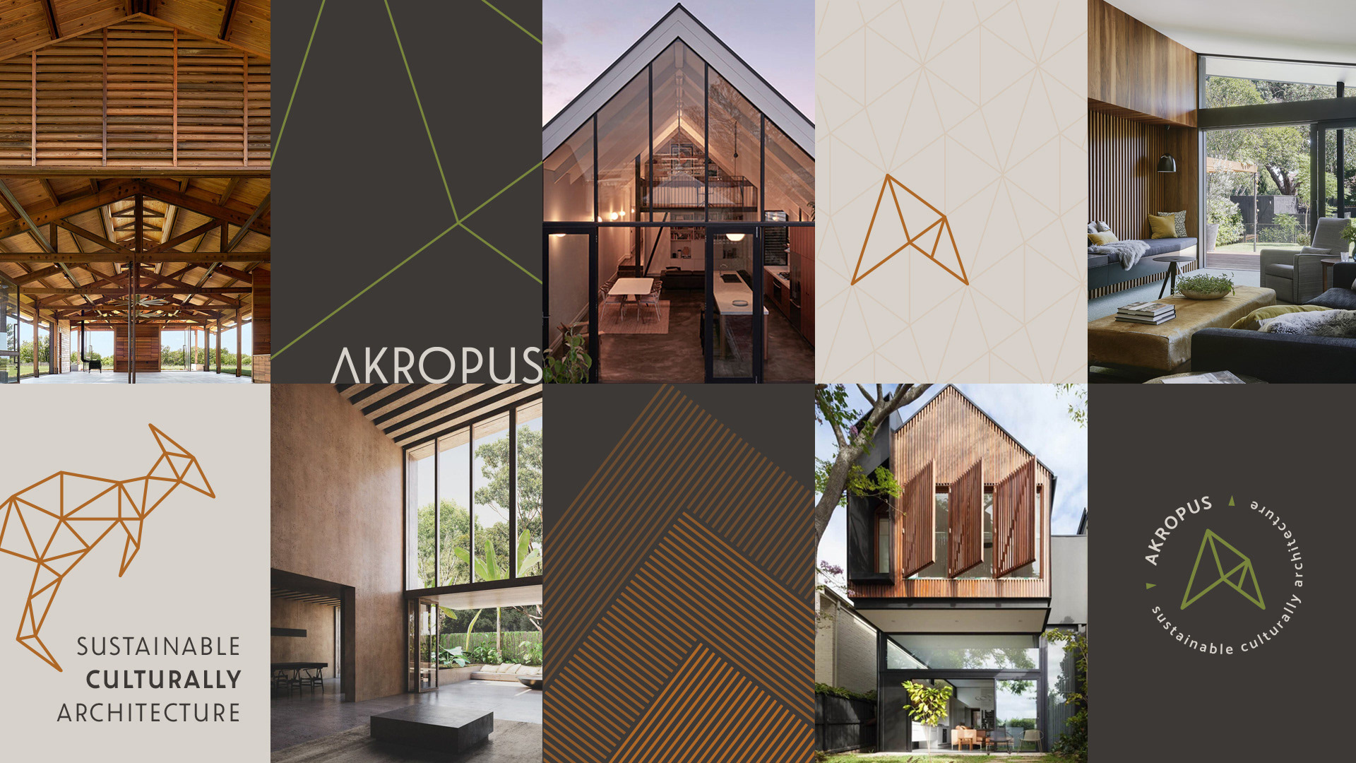
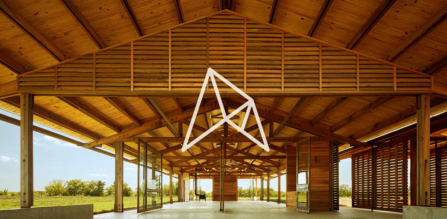
Um estúdio de arquitetura contemporânea focado em projetos sustentáveis, com um DNA enraizado na paisagem e no modo de vida australiano. A Akropus projeta e constrói com uma proposta de construções verdes, que leva em consideração os impactos ambientais em todo o ciclo de vida de um edifício, desde o planejamento até sua execução. O propósito é desenvolver uma arquitetura culturalmente sustentável, com a criação de espaços sensíveis, que respeitam o meio e melhoram a vida dos usuários.
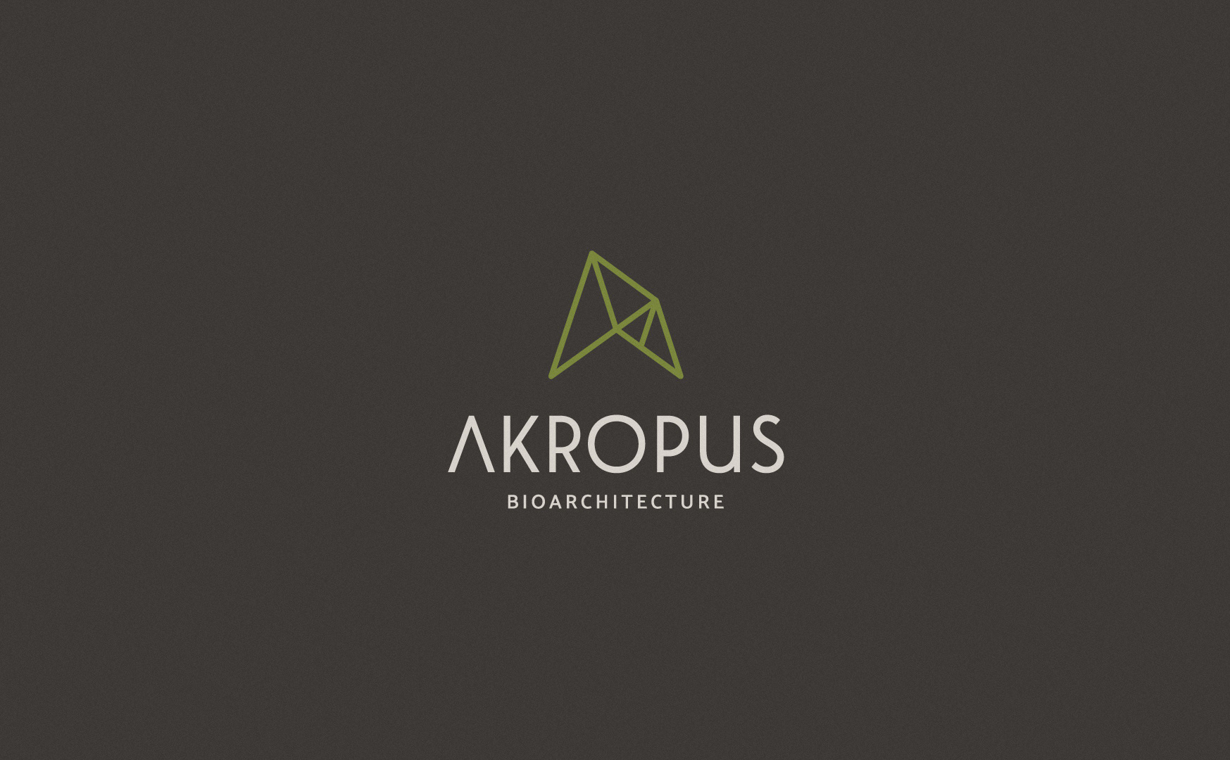
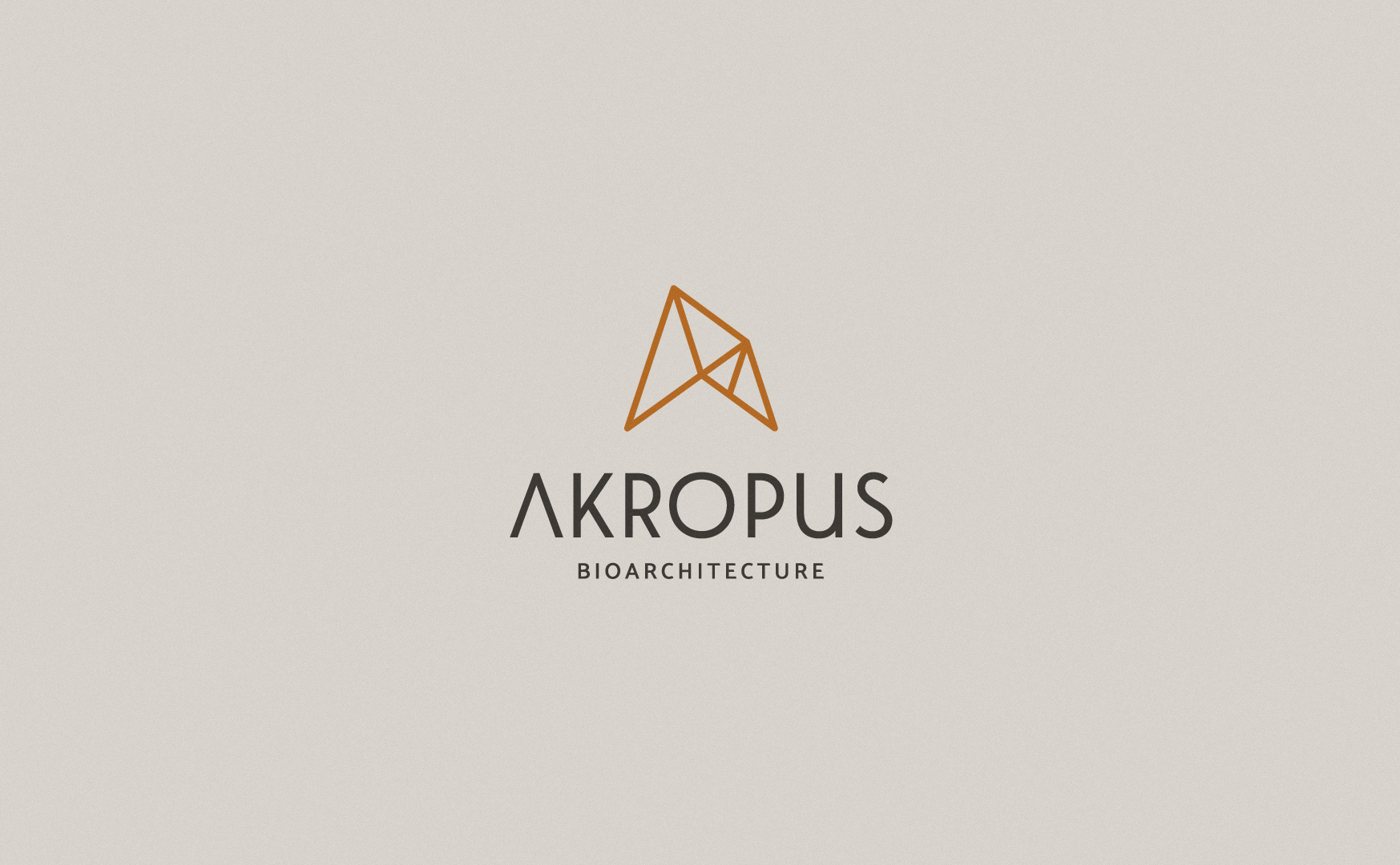
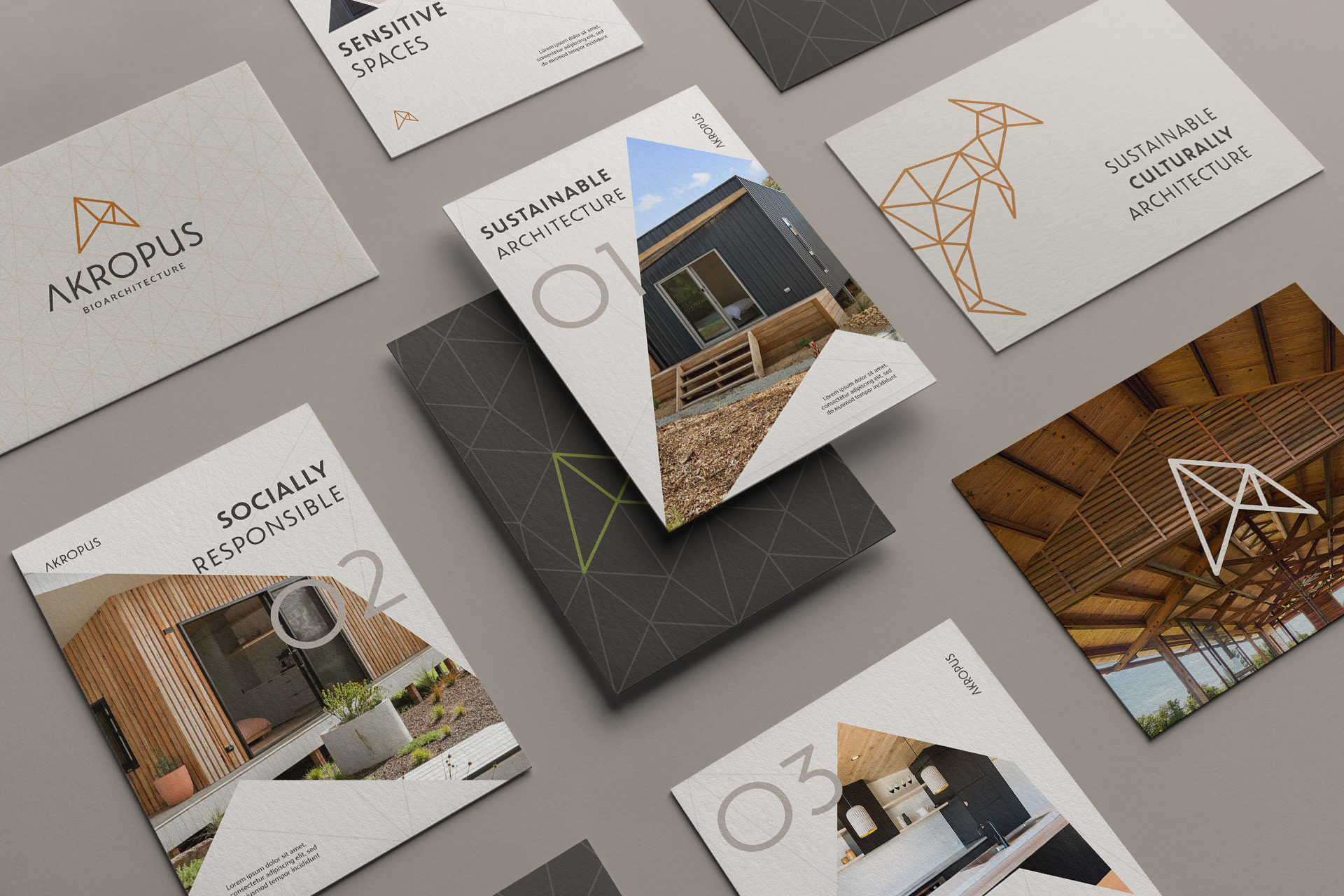
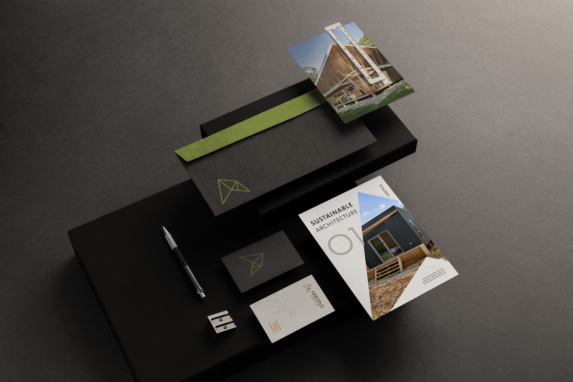
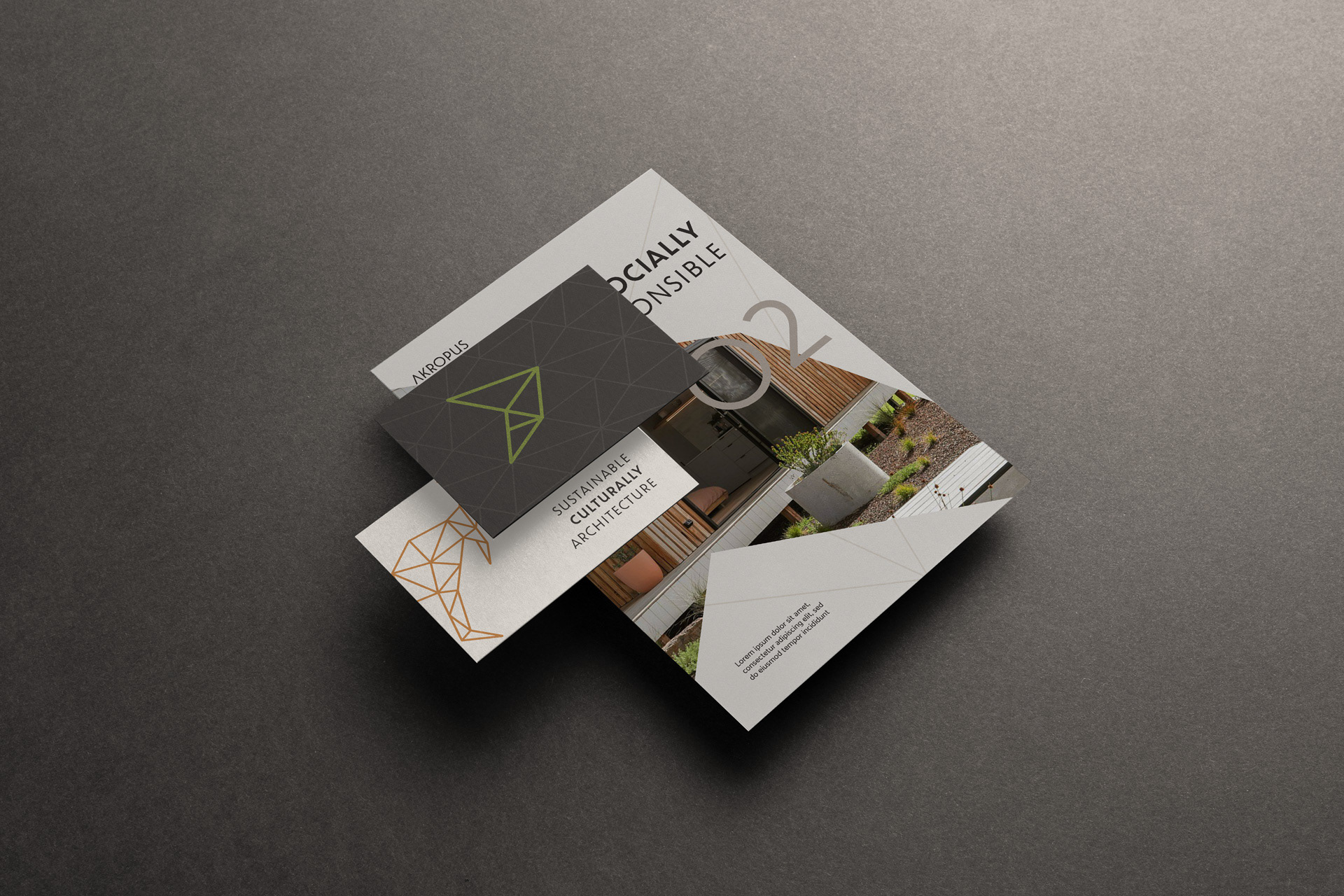
O desafio foi projetar, visualmente, uma marca que sintetiza esses princípios da bio arquitetura, que busca incorporar a natureza à arquitetura para criar ambientes para o futuro, que preserva e promove identidades locais. Uma marca que carrega a essência do design australiano, que busca recursos e oportunidades que a natureza apresenta para solucionar problemas visando o bem-estar humano. Na concepção da forma, o uso do triângulo representa o equilíbrio da tríade arquitetura - cultura - sustentabilidade, que orienta o posicionamento da marca.
[EN]
A contemporary architecture studio focused on sustainable design, with a DNA rooted in the Australian landscape and way of life. Akropus designs and builds for sustainability, with a proposal for green buildings, which takes into account the environmental impacts throughout the life cycle of a building, from planning to execution. The purpose is to develop a culturally sustainable architecture, with the creation of sensitive spaces that respect the environment and improve users lives. The challenge was to visually design a brand that synthesizes these principles of bioarchitecture, which seeks to incorporate nature into architecture to create environments for the future, which preserves and promotes local identities. A brand that carries the essence of Australian design, which seeks resources and opportunities that nature presents to solve problems for human well-being. In the conception of shape, the use of the triangle represents the balance of the triad architecture - culture - sustainability, which guides the brand positioning.
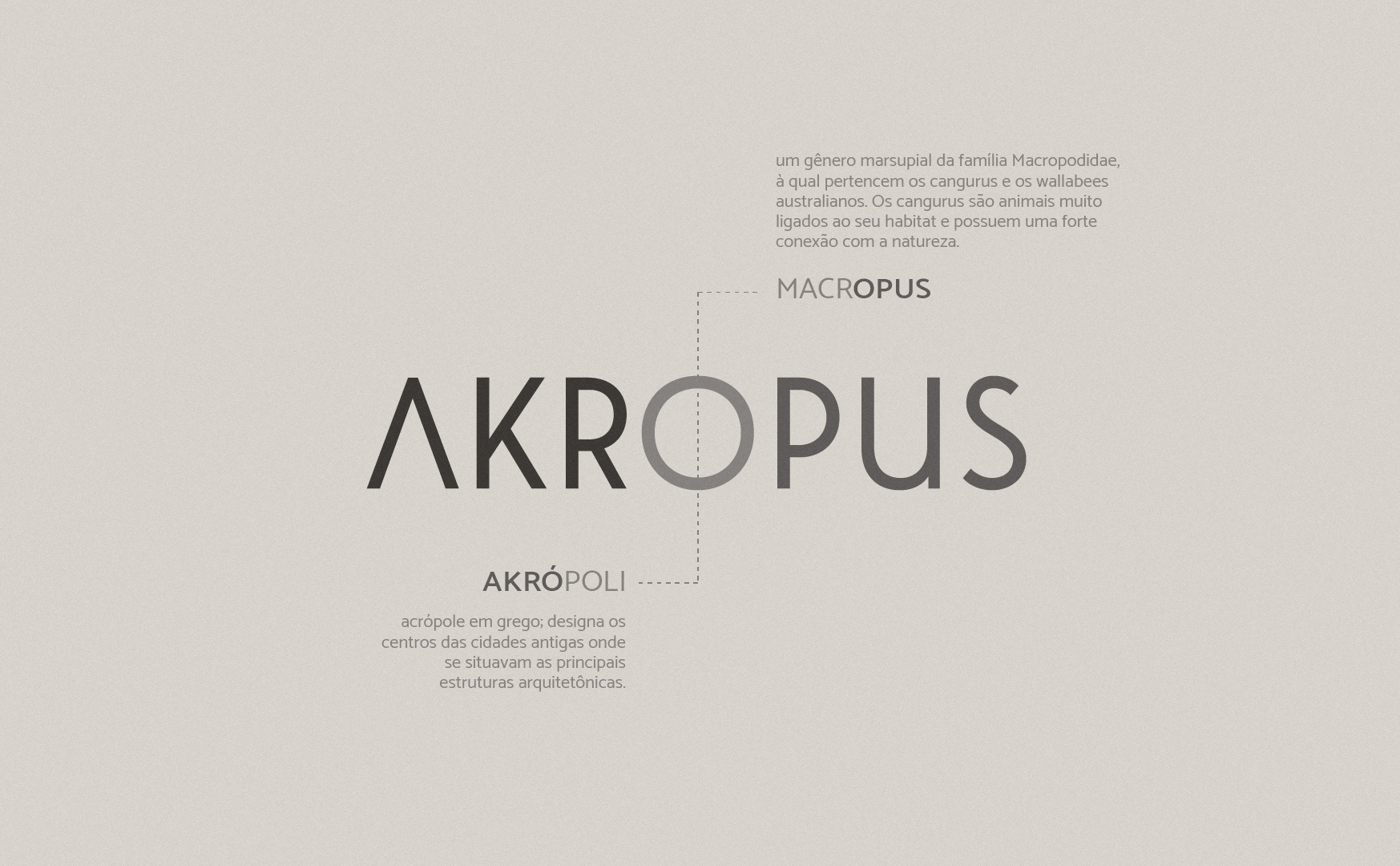
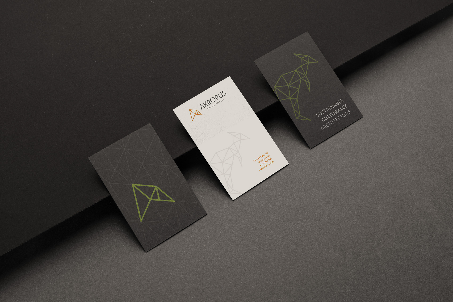
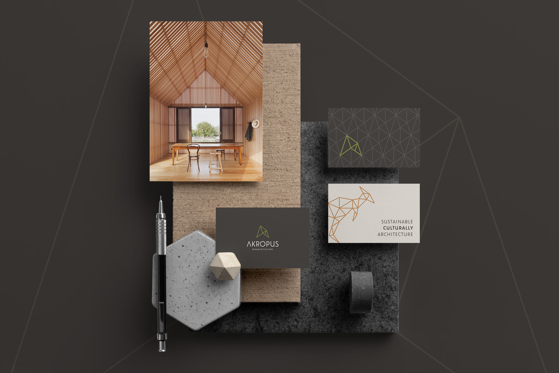
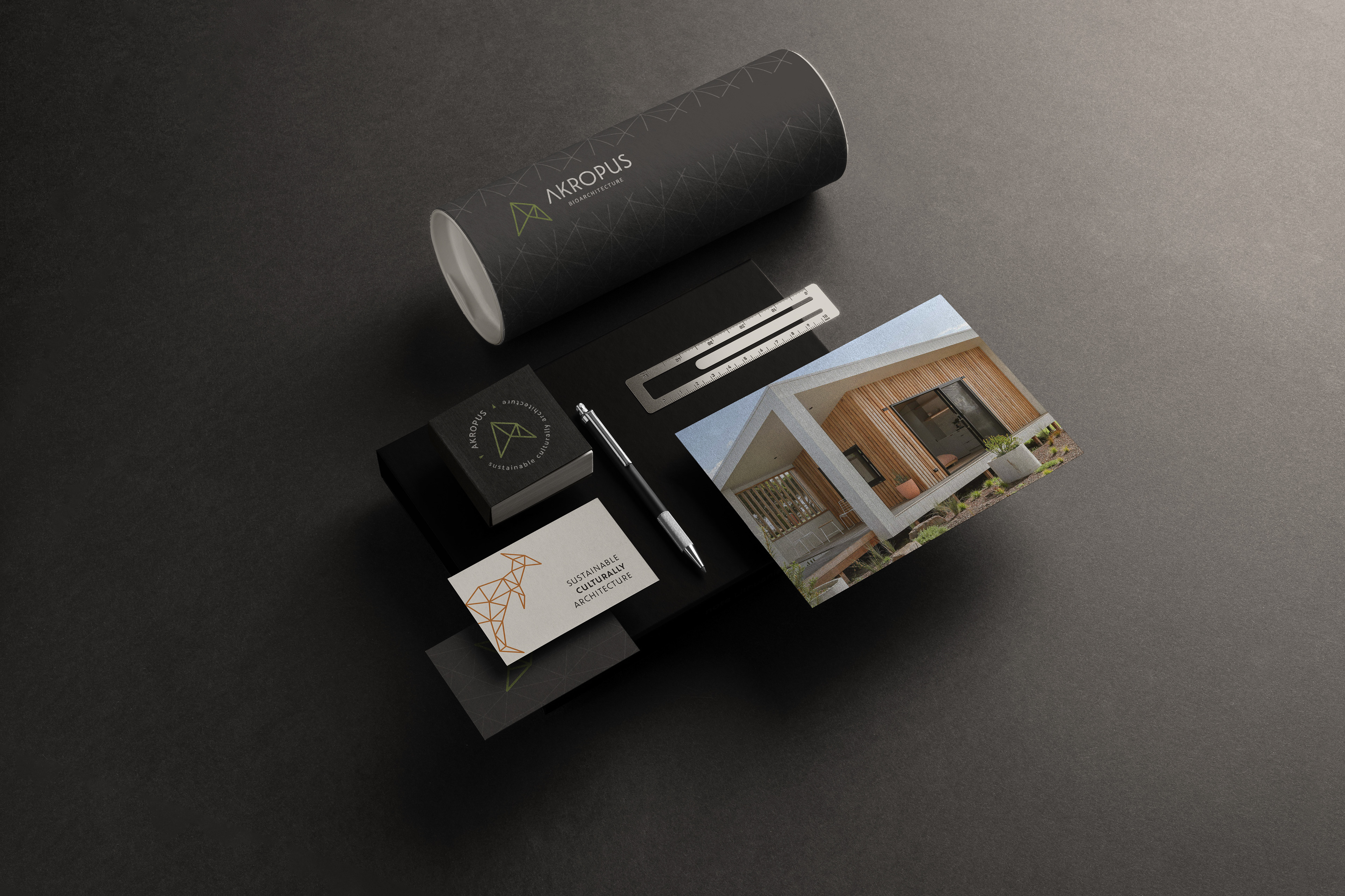
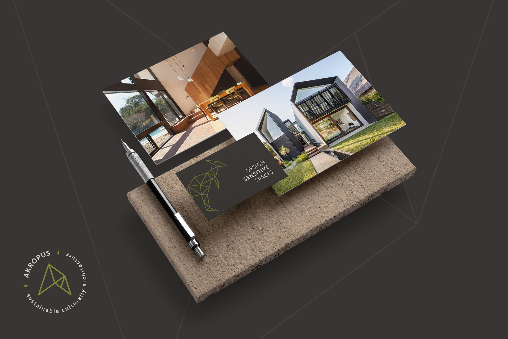
The creation of naming and the brand concept were inspired by the relationship between the pillars of architecture and Australian nature, bringing as a secondary mark the kangaroo, cultural and environmental preservation sign of the country. It is an element linked to Australian culture, which symbolizes strength, acceptance, adaptive capacity and protection.
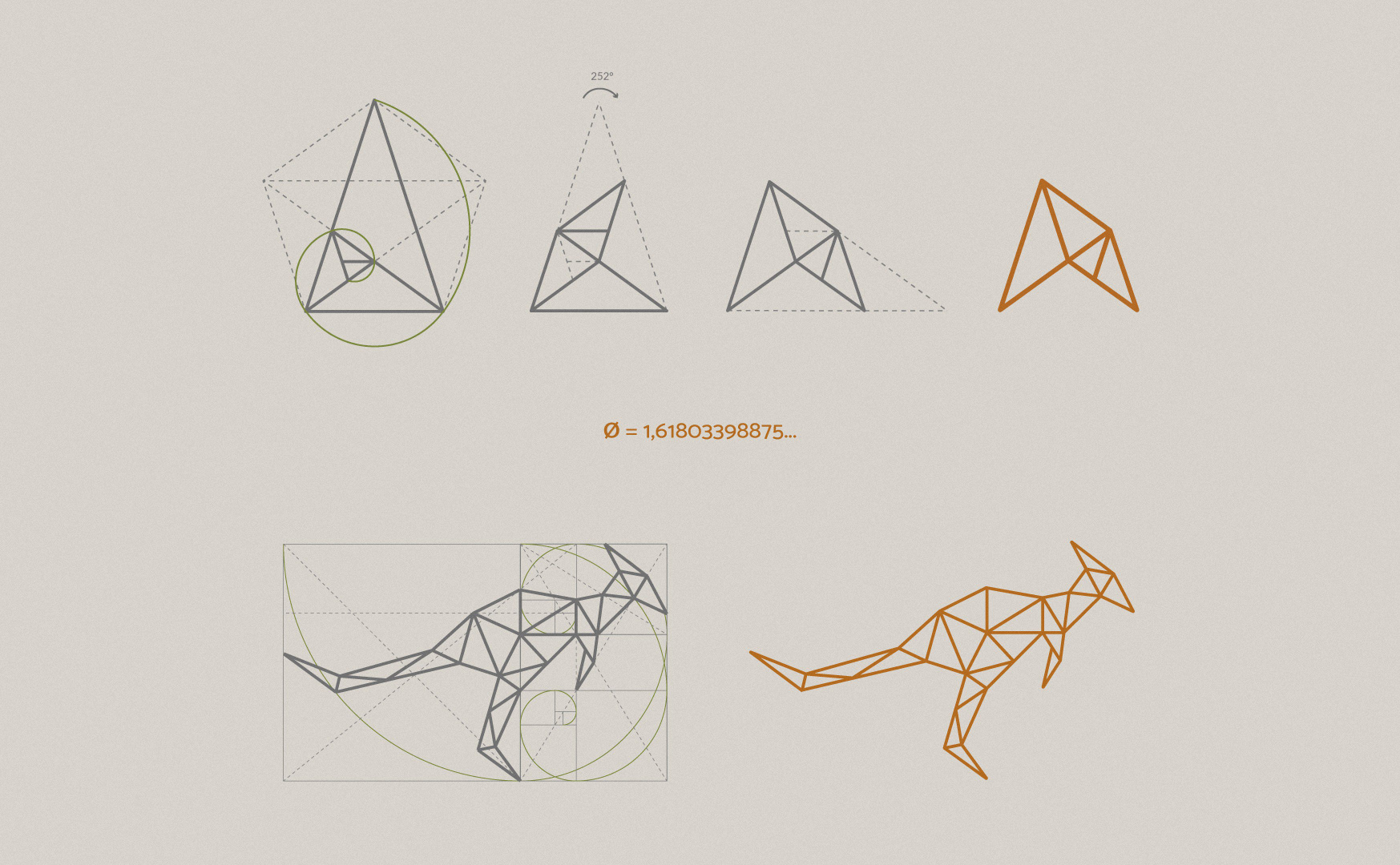
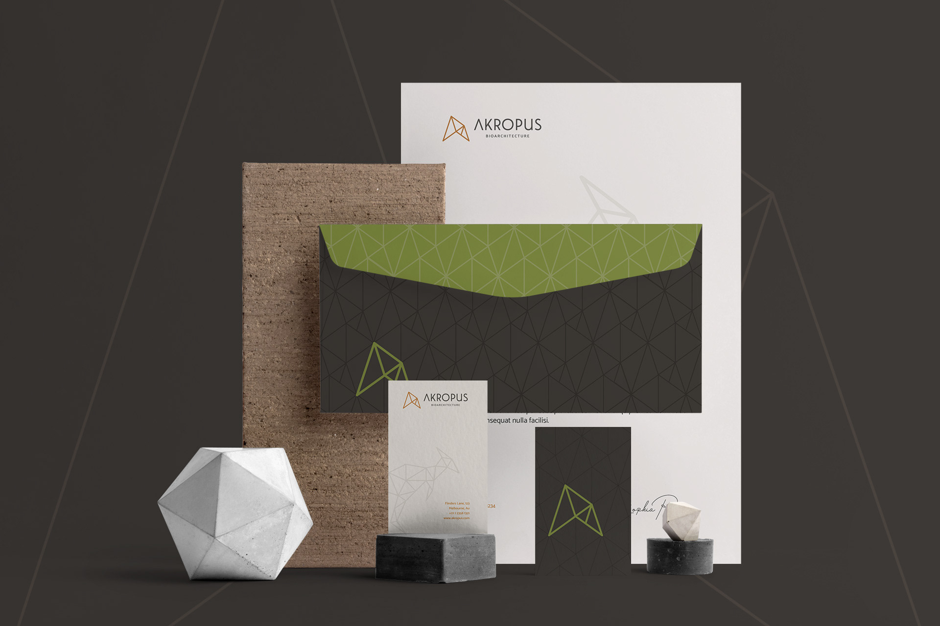
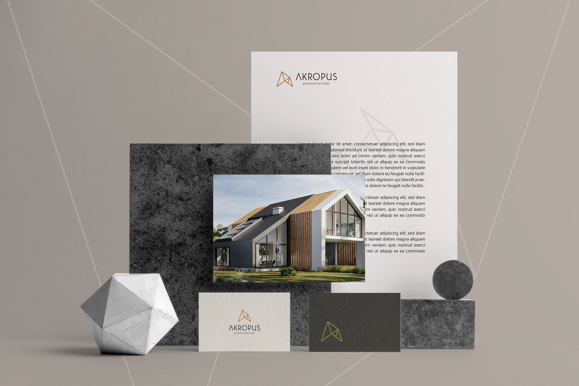
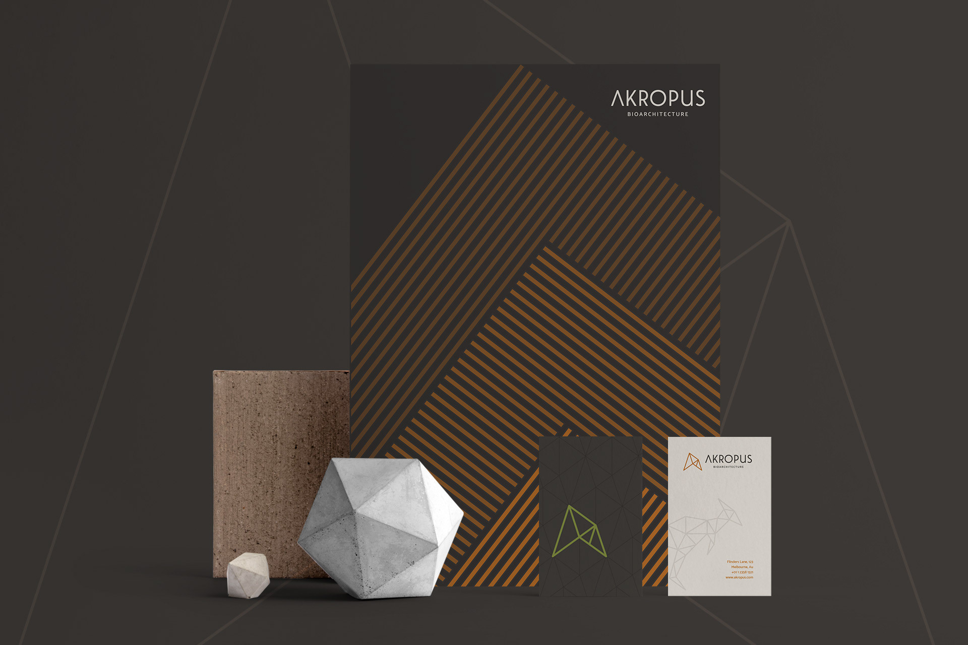
For the construction of the symbols, the golden ratio technique was used, present in Greek architecture and in elements of nature. It is a unique proportion, considered to represent a functional and aesthetic ideal.